Green Isn't a Trend Anymore — It's the New Neutral
If you've been scrolling Pinterest, eyewear blogs, or your favorite optical shop lately and noticed green frames showing up everywhere, you're not imagining it. According to 2026 trend reports from ZEELOOL's eyewear style desk, "Earth tones such as olive green, terracotta, and mustard are also gaining popularity and give a warm natural look" — and they're being treated less like statement colors and more like wardrobe basics.
That distinction matters. A statement color sits in your drawer for "going-out" days. A neutral lives on your face every morning. Three different optical industry reports from January through April 2026 — Verona Vision Care, Kuzo Eyecare, and Westsight Optical — all flagged green as a defining color of the year, with olive and forest green specifically called out as the new everyday neutrals. Forest green has also resurfaced in the 2026 revival of richly colored circular lenses, and Tom Ford's Spring/Resort 2026 collection featured tinted-lens models in green to runway acclaim.
So why three shades in the title? Because "green glasses" is the wrong way to shop. It's the same mistake people make when they search "red glasses" — there are at least four red shades that flatter different faces in completely different ways. Green is the same. Olive, teal, and emerald aren't variations of one color. They're three different design decisions, and they suit different people, different wardrobes, and different rooms in your life.
This guide is the breakdown an optician would give you in person if you walked in and asked "do green frames work for me?" — written with input from the Aoolia optical team, who fit and adjust roughly 30,000 prescription orders a year.
1. The Three Shades, Decoded
The single most useful thing this guide can do for you is teach you to see green the way an eyewear designer does. Here are the three positions on the green spectrum that matter — and how each one reads in real life.
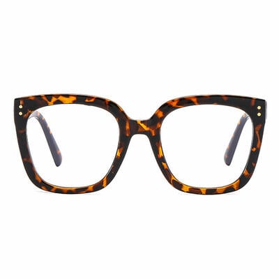
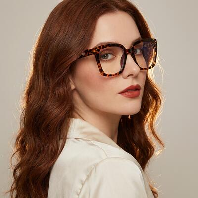
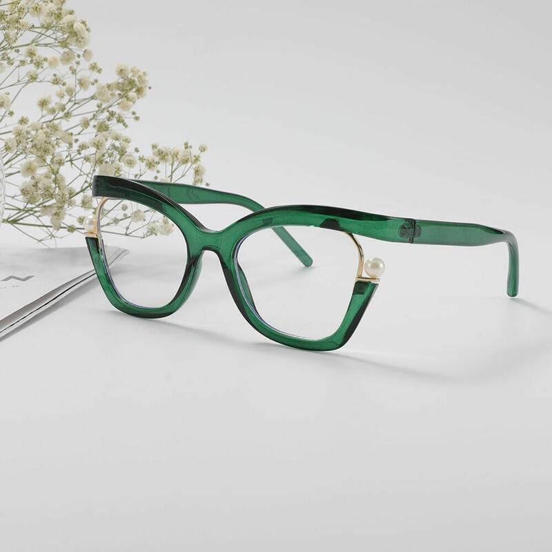
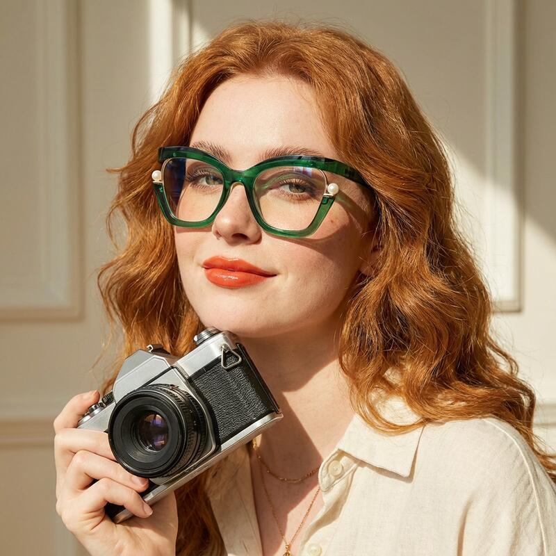
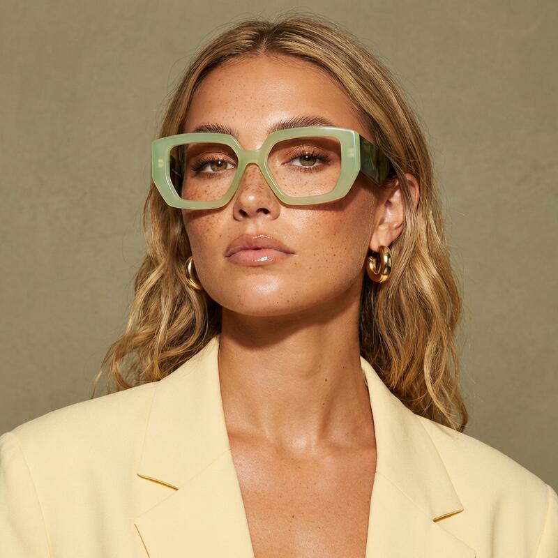
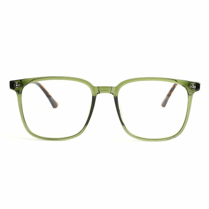
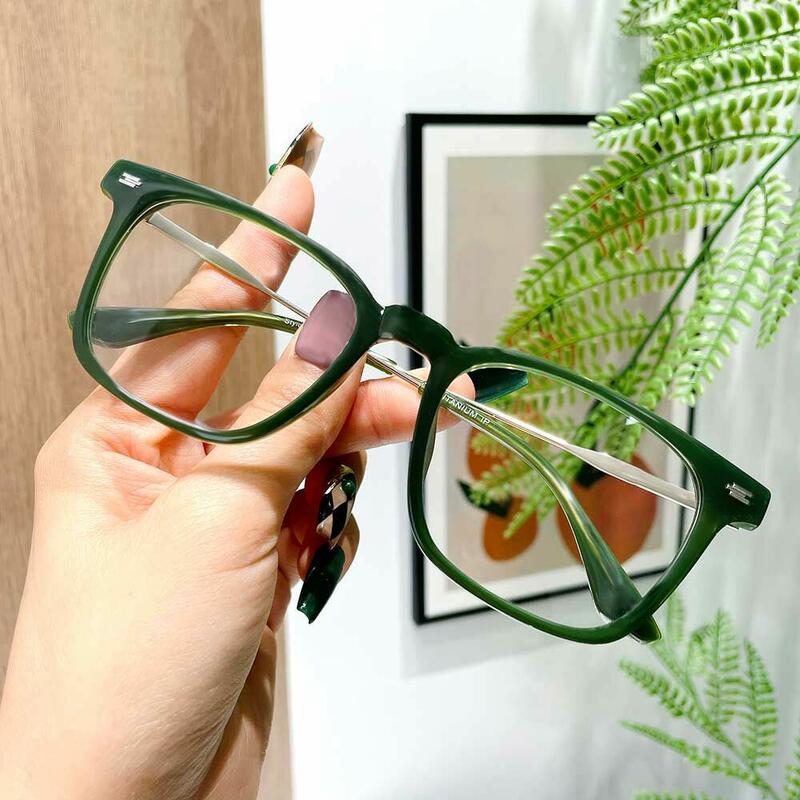
Olive Green — The Warm Neutral
Visual character: Brown-leaning green. Think dried sage, army jacket, or the inside of an unripe avocado. It's warm, which means it has yellow in it, not blue.
Reads as: Quiet, intentional, slightly bookish. Olive frames don't announce themselves the way a bright color does, but they're noticeably more interesting than black or tortoiseshell — which is exactly why fashion editors keep flagging them as the new neutral.
Cultural moment: "Powdery olive" appears in 2026 industry trend reports as one of the season's "new neutrals," alongside soft sage and dusty rose. Olive green is also being recommended specifically as a complement to warm skin tones.
Best for: Daily wear. If you're buying one green pair and want it to function like a year-round basic, olive is the answer. It pairs with denim, camel, cream, white, navy, black, and most earth tones — which is most American wardrobes.
Watch out for: Olive can shift in warm office lighting and read more brown than green. If you want the green to register, lean slightly more saturated.
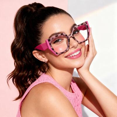
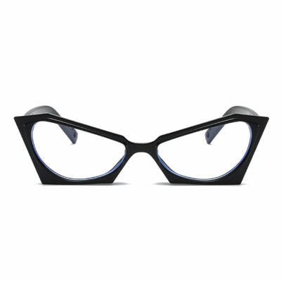
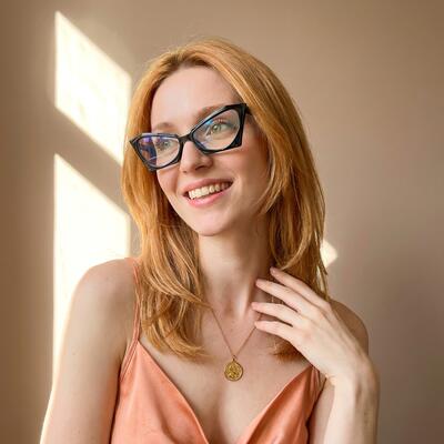
Teal — The Creative Statement
Visual character: Blue-green. Cool, slightly cyan, sometimes called "petrol" or "duck egg" depending on saturation. Teal sits roughly halfway between green and blue on the color wheel.
Reads as: Considered, creative, slightly artistic. Teal is the green that doesn't try to be a neutral. It's a real color choice, and people notice it — but it's not so loud that it limits your outfit choices the way bright cherry red or yellow would.
Cultural moment: Teal has had a quiet, decade-long run in design — it's been the most common "accent color" in interior design and graphic design since Pantone named Tidewater (a teal-adjacent shade) in its early-2010s color forecasts. It hits eyewear later than fashion because frame buyers tend to be conservative, but it's now firmly inside the mainstream.
Best for: People in creative, education, healthcare, design, or tech roles where personal style is allowed to show through. Also excellent as a second pair if your daily glasses are black or tortoise.
Watch out for: Teal needs cool-toned outfits or true neutrals to look polished. Pair it with mustard or warm camel and it can look slightly mismatched.
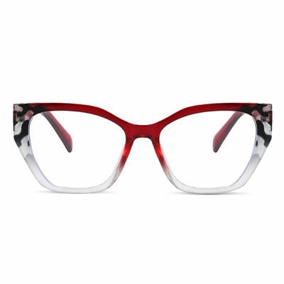
Emerald — The Evening Jewel
Visual character: Deep, saturated, jewel-toned green. Cool-leaning but not as cool as teal. The green of pine needles, of malachite, of the literal stone.
Reads as: Polished, glamorous, evening-coded. Emerald is the green equivalent of burgundy in red — it has weight and seriousness that brighter greens don't.
Cultural moment: Emerald was Pantone's Color of the Year in 2013, and unlike most COTY picks, it never really left. It's the most photogenic green for camera work, and it photographs especially well against pale and medium skin under warm lighting (which is why it shows up so reliably at award shows).
Best for: Statement wear. Date-night frames. Photography. Anyone who already has a "daily driver" pair and wants a second pair with personality.
Watch out for: Emerald is heavier than the other two and can read formal in casual settings. It's not the green to wear on a Saturday in athleisure.
Shade Decision Tree (Simplified)
Want green but want it to feel like a neutral → olive
Want green and want it to read as "a color choice" → teal
Want green that's elegant, evening-ready, and photographs well → emerald
Warm skin undertones → olive first, emerald second
Cool skin undertones → teal first, emerald second
Need it to work in a conservative office → olive
Need it to be your daily, do-everything pair → olive
Need a second pair with personality → teal or emerald
Photographing content regularly → emerald
2. Which Green Suits Your Skin Undertone
The 30-second test for your undertone: look at the veins on the inside of your wrist in natural daylight. If they read blue or purple, you're cool-toned. If they read green, you're warm-toned. If you can't decide, you're neutral, and almost any green will work — start with olive or emerald.
A note on what you'll actually see in a mirror: skin lighting in optical stores is almost always warm fluorescent, which makes olive look browner and teal look greener than they will in daylight. If you're choosing online (which you probably are), trust the product photos shot in neutral light, not the swatch on your phone in a yellow-lit room.
3. Eye Color × Green Frame: The Green-on-Green Question
This is the question that lands in our inbox more than any other when we run green glasses promotions:
"I have green eyes. Will green glasses make my eye color disappear?"
The honest answer is no, but with a caveat. Standard color theory says complementary colors (the ones opposite on the color wheel) amplify each other — which is why red frames are famously flattering to green eyes (they're opposites). Some people read this and conclude that green frames must do the opposite and "cancel" green eyes.
In practice, that's not how it works. Here's what actually happens:
Green eyes + olive frames: The frame is duller than the eyes, so the eyes still register as the brighter color in the face. Olive flatters green eyes by harmonizing without competing. Most flattering, most subtle.
Green eyes + teal frames: The blue in teal pulls out any blue or gray flecks in the iris and creates a soft layered effect. Especially flattering on hazel-green or blue-green eyes.
Green eyes + emerald frames: This is the only combination where the frame can compete with the eye color, because emerald is more saturated than most green irises. The result reads intentional and editorial rather than "canceled" — but it's a stronger look. Good for evening; less ideal as a daily.
And for everyone else:
Blue eyes: Any green works. Teal and emerald create especially striking contrast.
Brown eyes: Olive and emerald flatter most. Teal is fine but less transformative.
Hazel eyes: All three work, and green frames specifically pull out the green flecks in hazel irises — often the single most flattering eyewear color for hazel eyes.
Gray eyes: Teal is exceptional. The blue undertone in teal harmonizes with gray's cool quality.
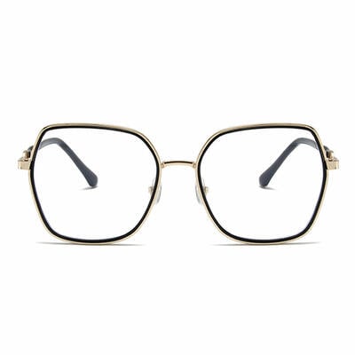
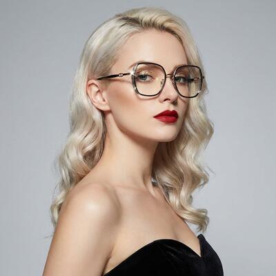
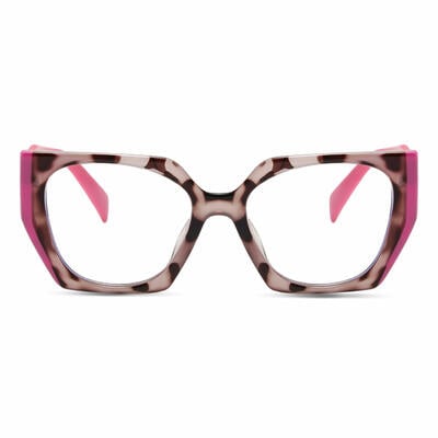
4. Shape Pairings: Frame Style × Shade
Not every frame shape works equally well in every green. Some combinations are timeless; some look slightly costume-y.
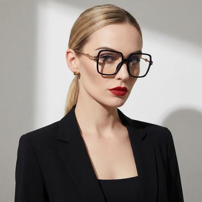
Olive works with most shapes, especially: rectangle, square, oversized round, browline, classic aviator. Olive in a wayfarer or square reads like a smart, slightly preppy basic.
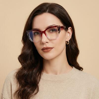
Teal works best in: cat-eye, round, geometric, oval. Teal in a cat-eye is one of the most popular shapes in the entire Aoolia color catalog. Teal in a heavy square can occasionally read more "tech founder costume" than intended — keep teal in shapes with some softness.
Emerald works best in: oval, round, cat-eye, modified rectangle. The shape should be slightly elegant to match the shade's natural formality. Emerald in a chunky geometric frame is the riskiest combination on this page — striking when it works, costume when it doesn't.
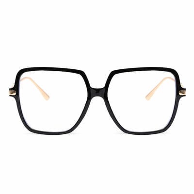
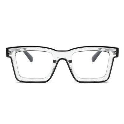
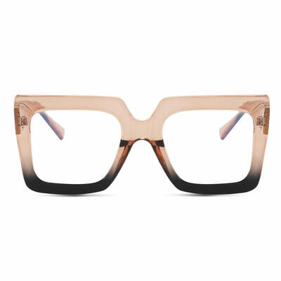
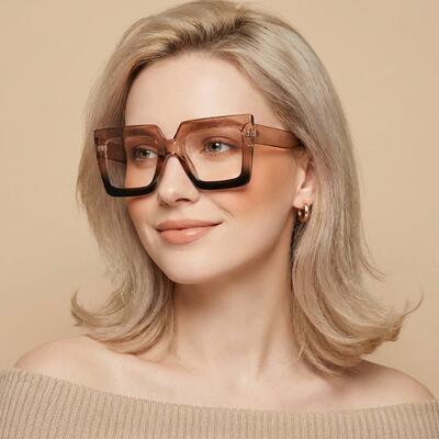
Universal: avoid in any green: Sport-wrap shapes (the color reads dated), and rimless (rimless glasses don't have enough frame surface area to carry the color meaningfully — you're paying for color you barely see).
5. Materials, Manufacturing, and Why Some Greens Fade
This is the section most green-glasses guides skip, and it's the one that actually matters six months after you buy.
Green frames are typically made one of three ways, and the manufacturing method determines whether the color stays true:
1. Dyed-through acetate (best)
The acetate sheet is dyed all the way through before the frame is cut. The color exists throughout the material, so if the frame gets scratched, the underlying color matches the surface. Premium green frames — most of what the Aoolia optical team selects — are made this way.
Identifier: When you look at the inside of the temple, the color matches the outside. If you can see exposed edges on the frame (around the hinges, on the rim where it meets the lens), the color is consistent.
2. Acetate with a surface tint
A clear or lighter acetate base is dipped or coated to achieve the green color. Cheaper, and the color can wear or fade at high-friction points (the bridge, where temples touch behind the ears).
Identifier: Inside of the temple is noticeably lighter than the outside. Often used on frames under about $25.
3. Painted metal
Metal frames are typically powder-coated or enameled green. Good metal coatings are durable; bad ones chip at hinge joints within 6–12 months, especially in teal and emerald, where the underlying metal shows through obviously when it does.
Identifier: Run a fingernail gently along the inside edge of the rim. A high-quality coating won't catch; a thin one will feel like there's a step where the paint ends.
The fade issue, specifically
Green pigment is one of the more UV-sensitive colors in the eyewear chemistry palette — particularly emerald and bright teal, which use organic pigments that can drift slightly over years of sun exposure. Olive is more stable because it uses iron-oxide based pigments similar to those in tortoiseshell.
Practical implication: If you wear green prescription glasses daily and live somewhere sunny (Arizona, Florida, Southern California), expect a high-quality emerald frame to look essentially unchanged for two to three years, then begin to soften slightly. A surface-tinted budget frame may visibly fade within 12 months. This is why we generally recommend dyed-through acetate for green frames, even if it costs a bit more upfront.
6. What to Wear With Green Glasses
The "costume" trap is the single biggest fear with colored frames. Green has one of the widest safe palettes of any frame color — but a few combinations work spectacularly, and a few should be avoided.
Works beautifully with green frames:
White, cream, off-white — the cleanest possible backdrop
Black — high-contrast, sharpens the green
Navy — especially good with teal and emerald
Camel, tan, beige — warm neutrals that complement olive particularly
Denim, chambray, light blue — green's natural pairing
Brown, chocolate, rust — earth tones that build on olive's warmth
Burgundy — the secret pairing. Green and burgundy are tonally adjacent in a flattering way
Works with care:
Yellow and mustard — works with olive (it's an earth-tone family), risky with teal
Pink — soft dusty pink works with teal especially; bright pink fights with all three
Other greens — green-on-green dressing is editorial and intentional; keep tones in the same family (sage shirt with olive frames, not bright lime shirt with emerald frames)
Generally avoid:
Multiple bright colors that compete with the frame
Bright orange or red, which fight directly with all greens
Heavy patterns that include green (the frame will get visually swallowed)
Jewelry and accessories
Gold pairs best with olive and emerald (warm metal + warm-leaning greens)
Silver pairs best with teal (cool metal + cool green)
Mixed metals work with all three — the green provides the visual anchor
7. Where to Start: Price Tiers
Green prescription frames span a wide price range, and the differences are real but predictable.
$10–$30 (budget): Surface-tinted or basic dyed acetate. Best for trying the color out — a low-risk way to find out if you actually enjoy wearing green daily before investing more. Expect a 12–24 month lifespan in daily use.
$30–$80 (mid-range): Dyed-through acetate, properly fitted temples, decent hinges. This is the sweet spot for most buyers, and where most of Aoolia's green collection sits. A pair in this range, well cared for, lasts 3–5 years easily.
$80–$150 (premium): Italian or Japanese acetate, finer detail work, sometimes branded or limited-edition. Worth it if you wear glasses every day and want the green to be a defining piece of your style.
$150+ (designer): You're paying largely for the name. The acetate is rarely better than the $80–$150 tier; the difference is brand recognition and design lineage.
Practical advice: If green is your first non-neutral pair, start in the $30–$80 tier. If you discover you wear them more than your black or tortoise frames after three months, that's the signal you're ready to invest in a premium pair the next time.
Final Word From the Aoolia Optical Team
If we had to pick one frame color for a customer who's nervous about stepping out of black or tortoise for the first time, it would be olive. It's the lowest-risk way into the colored-frame world — flattering on the widest range of skin tones, appropriate in every workplace, photographs well, doesn't fade quickly, and looks intentional without looking loud.
If you already wear color confidently and want a second pair with more personality, teal is the most-loved shade in the green catalog among our repeat customers — particularly in cat-eye and round shapes.
And if you want the green that walks into a room and gets remembered, it's emerald — but understand you're buying a statement piece, not a daily driver.
Browse the full green glasses collection →