The Cultural Math on Pink Has Changed
There's a generation of Americans — anyone who came up in the late '90s and early 2000s — who carries a specific memory of pink eyewear. Plastic. Glittery. Sold at Claire's next to butterfly clips. The unspoken rule was: pink glasses were for kids, and you grew out of them.
Then 2023 happened. The Barbie film opened to a billion dollars and a cultural reset on what pink was allowed to be. Pinterest's 2024 trend report flagged "dopamine pink" as one of the top color-driven searches for the year. Pharrell Williams wore a hot-pink Chanel haute couture suit to a runway show. By the time Time magazine ran its "Power of Pink" cover at the end of 2023, the conversation about pink as a serious color choice was over — it had won.
What this means for eyewear, practically: pink is no longer a concept you have to defend. The question isn't whether you can wear pink frames as an adult. It's which pink, why this one, and will you actually reach for them after the novelty wears off — which is the only question that matters for anything you're going to put on your face every day.
This guide is structured around that real question, not the comfortable surface ones.
Section 1 — The Pink Buyer's Paradox
Here's something we've learned watching how customers actually behave with pink frames over the past two years: pink has the highest pre-purchase anxiety of any frame color we sell, and the lowest post-purchase regret rate.
That gap is the most interesting thing about pink, and worth thinking about before you choose a shade.
People hesitate on pink because they're afraid of three things — looking too young, looking too "girly," or buying frames that gather dust in a drawer after one Instagram photo. But once they own a well-chosen pink frame, the return-and-exchange rate is actually slightly below our color average. The frames get worn.
The reason, as best we can tell from talking to customers: people overestimate how loud a well-chosen pink looks in real life. Photographed under ring light, pink reads as a statement. Worn in person, under regular daylight or warm office lighting, blush and dusty rose read as almost-neutrals. The frame that looked daring at home in the mirror reads as interesting in the conference room — and "interesting" is exactly the territory most people are actually trying to occupy when they buy a colored frame.
The flip side: this gap only closes if you choose the right pink for what you actually want. Choose wrong, and the frames will live in the drawer. The next section is about choosing right.
Section 2 — The Three Pink Archetypes (Not the Six-Shade Chart)
Most eyewear guides will hand you a chart with eight shades of pink and tell you to find your match by skin undertone. We've tried that approach with our customers, and the honest result is that it's not useful — because the question isn't which pink color matches your face, it's what role do you want the frames to play in your day.
The 163 pink frames in Aoolia's collection fall into three distinct purposes. Choosing your purpose first, then your shade, fixes almost every "will I actually wear them" problem before it starts.
Archetype 1 — The Soft Anchor
The role: A pair of glasses you reach for as easily as a sweater you've owned for five years. Adds warmth to a face without announcing itself. Reads as "approachable" in professional settings.
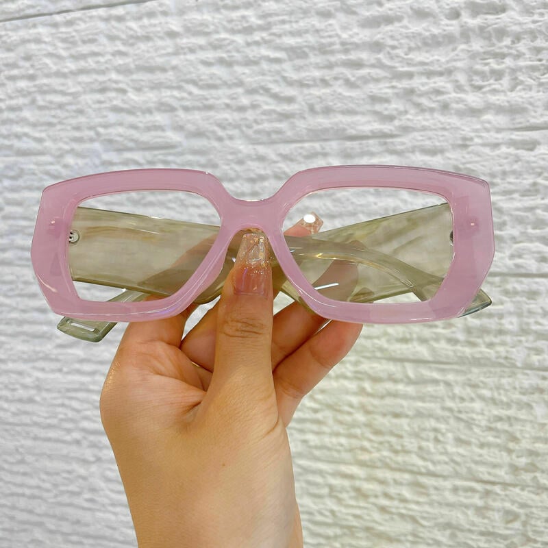
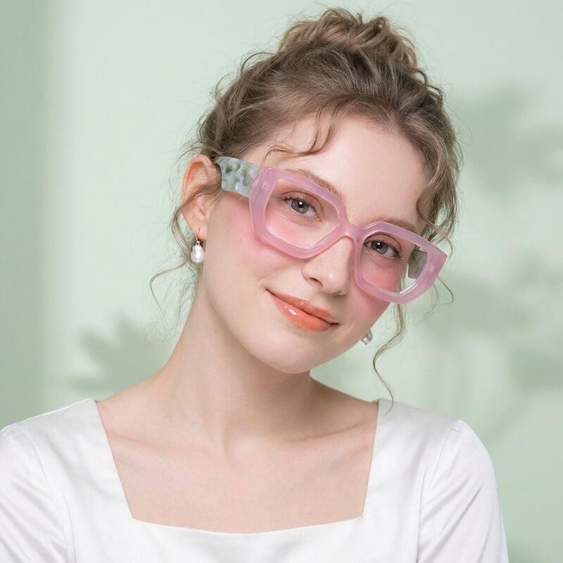
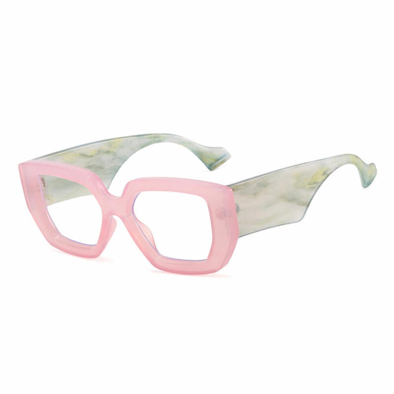
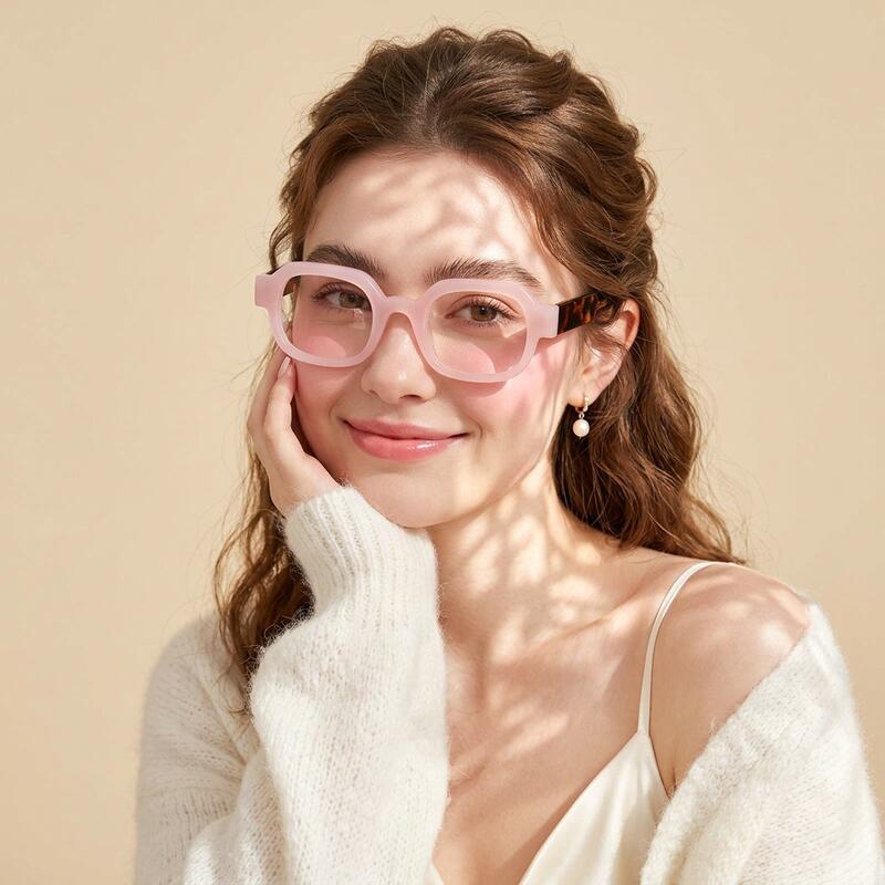
The shades that do this: Blush pink. Dusty rose. Milky pink. Translucent pink with the faintest rose tint.
Why it works: These pinks contain a high proportion of white or warm beige. On the eye, they read as warm neutrals — closer in perceived weight to champagne or honey tortoise than to "pink." That's why they survive in conservative offices. They never call themselves pink unless someone asks.
Who this archetype is for: First-time pink wearers. Anyone whose closet skews toward neutrals (camel, cream, beige, soft gray). People who've owned tortoise or clear frames before and want one small note of warmth.
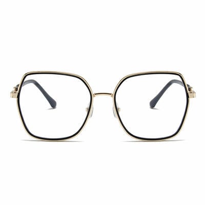
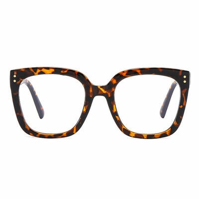
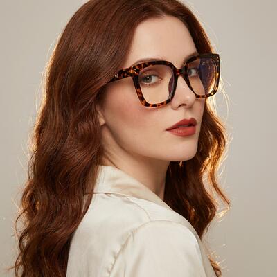
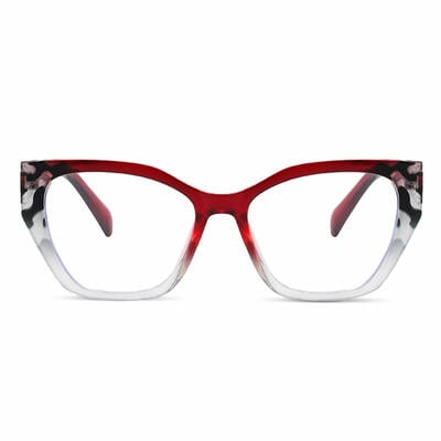
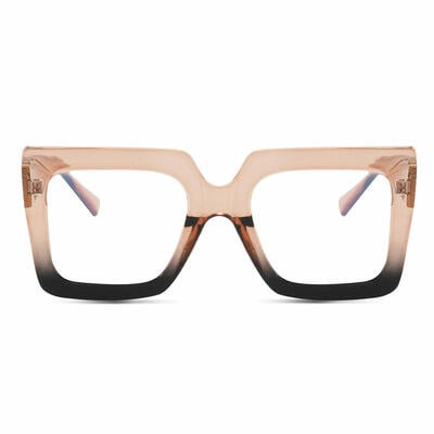
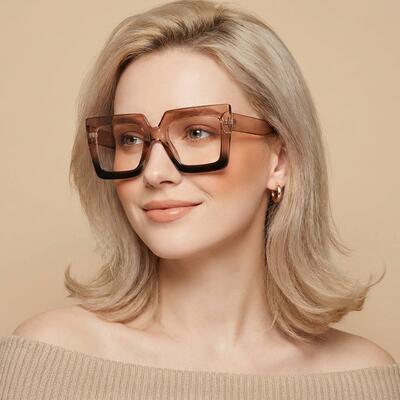
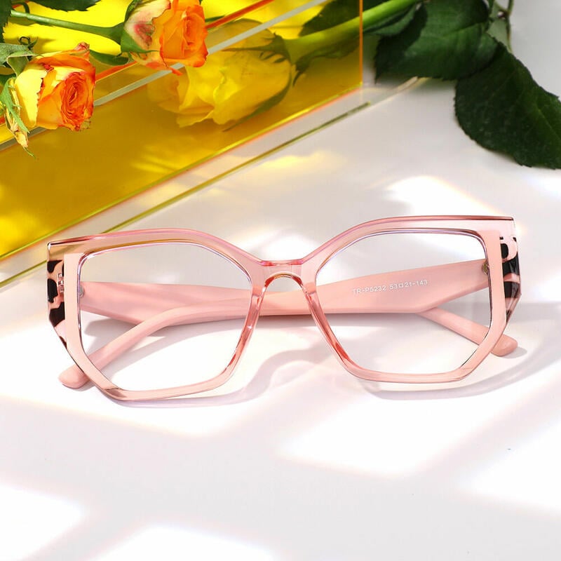
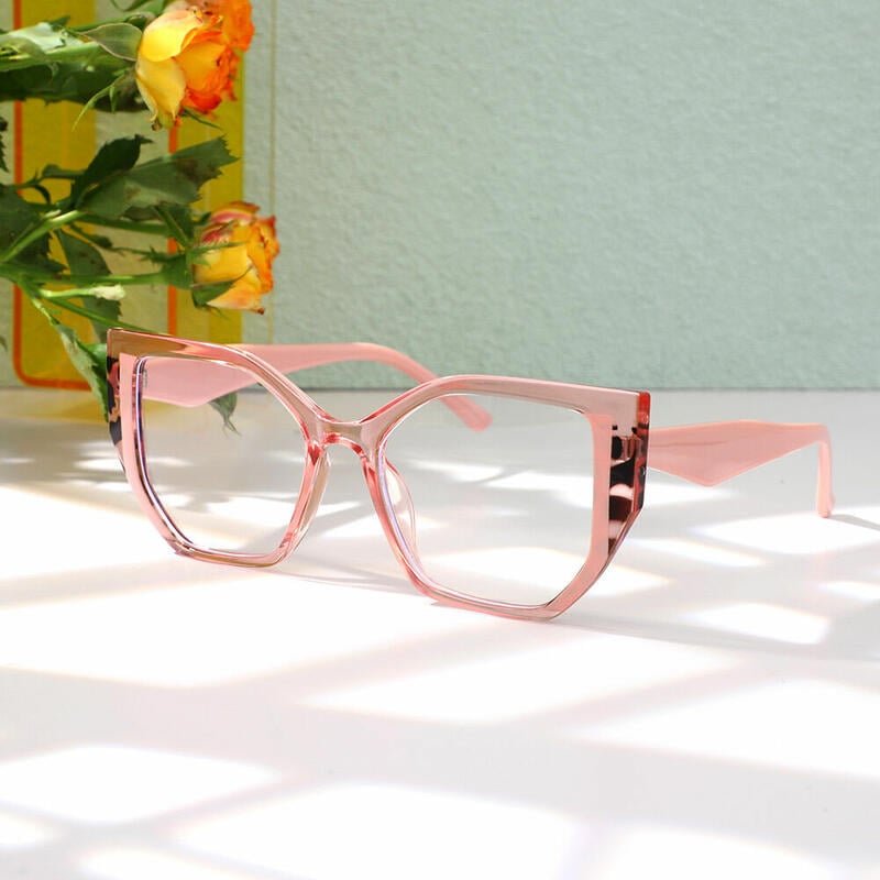
What to look for in the catalog: Square and cat-eye silhouettes in acetate. Aoolia's Flossie, Bronte, and Cotton sit firmly in this archetype — each is a square in a softened pink that reads almost like a warm beige under most lighting. The 50 acetate styles in our pink collection are concentrated here for a reason: acetate's slight translucency softens pink in a way TR90 and metal can't.
Pairs with: Cream, white, light camel, soft gray, denim, sage green, ivory knitwear. Avoid: matchy hot pink lipstick, oversaturated blush. The frame is the warm note; everything else should be quiet.
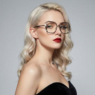
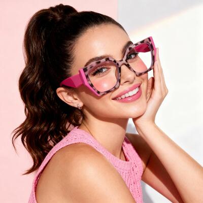
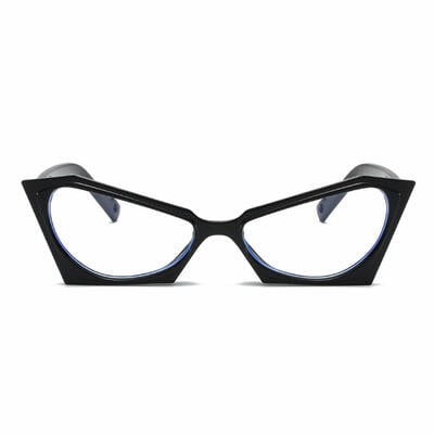
Archetype 2 — The Statement
The role: A frame that you wear because it gets noticed. The wardrobe equivalent of a signature lipstick — same energy, twice the surface area.
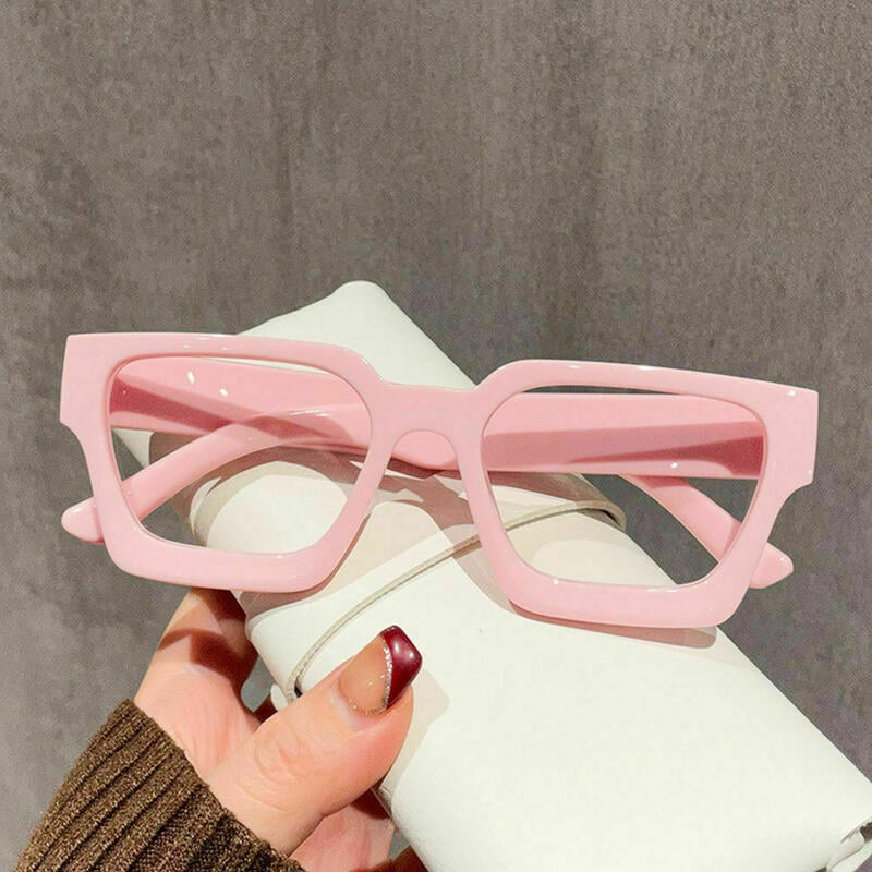
The shades that do this: Hot pink. Magenta. Fuchsia. Bubblegum. Coral-leaning pinks with high saturation.
Why it works: High-chroma pink has a unique property among warm colors — it draws the eye to the upper half of the face without darkening it. That's the opposite effect of black or tortoise. If your goal is to make eye contact memorable, hot pink does this more efficiently than any other frame color.
Who this archetype is for: People with a clearly developed personal style who use accessories as voice. Creative-industry workers. Anyone who has a "signature item" already (a red lipstick, a bold haircut, a particular jacket) and wants the eyewear to match the energy.
What to look for in the catalog: Cat-eye in saturated pink. Larger geometric shapes. Cat-eye is the strongest pairing for statement pink — the upswept corners amplify the color's already-extroverted properties. The Wanda, Sylvia, and Burke cat-eyes in our collection are built for this archetype. There are 57 cat-eye pinks in the catalog (the largest single shape category in pink, which itself tells you something about who buys pink and why).
Pairs with: Black, white, chocolate brown, deep navy, charcoal — neutrals so the frame doesn't have to compete. Avoid: any other bright color. The most common styling mistake with statement pink is treating it like one accessory among many. It isn't. It's the accessory.
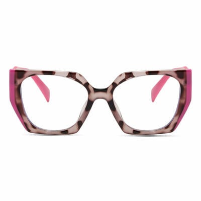
Archetype 3 — The Quiet Subversion
The role: Pink that doesn't read as pink at first glance, but rewards a second look. The fashion industry calls this "power dressing in disguise."
The shades that do this: Rose gold metal. Pink-tinted clear acetate. Two-tone frames with pink on the inside of the temples (so the wearer sees pink in the mirror; observers don't from the front).
Why it works: Rose gold registers visually as a metal first and a color second. It carries the warmth and softness of pink without the cultural associations. This is why rose gold has been the dominant metallic in jewelry, phones, and consumer electronics for almost a decade — it lets people opt into pink without committing to it socially.
Who this archetype is for: People in conservative industries who want personality without political read. People who are aesthetically drawn to pink but haven't worn it on their face before. Men who are genuinely curious about pink frames but want a starting point that doesn't feel like a public announcement.
What to look for in the catalog: Rose gold metal aviators, rectangles, and rounds. The Montague rose gold rectangle in our collection is the textbook example — it photographs as a warm metal, not "pink glasses," and reads completely differently than the saturated cat-eyes in Archetype 2 even though both are technically in the pink category. Aoolia has 23 metal pinks and 12 titaniums; almost all of them belong in this archetype.
Pairs with: Anything. This is the most versatile of the three. Black tie, athletic wear, scrubs, business casual — rose gold metal absorbs whatever you wear with it.
Section 3 — The Pink-for-Men Question
This is the most-searched pink eyewear question on Google by American men, and it deserves a direct answer rather than the usual reassurances.
Short version: Yes, but probably not the pink you're picturing.
The 71 men's pink frames in our catalog overwhelmingly fall into Archetype 3 — rose gold metal, two-tone titanium, dusty translucent acetates with a desaturated rose cast. The bright bubblegum pink you might be imagining is not what most men who buy pink frames actually buy.
The cultural ground is much firmer now than it was even five years ago. NFL players wear pink cleats every October for Breast Cancer Awareness Month and continue to wear pink off the field. Pharrell Williams' pink Chanel suit moment was 2018, and it didn't fade — it accelerated. Designers from Tom Ford to Jacquemus put men in pink on the runway every season. The teenagers who watched Barbie in 2023 are now in college, and they buy pink without thinking about it.
Practically, for an American man considering pink frames in 2026:
Rose gold metal is the easiest entry. It reads as "expensive metal" before it reads as "pink." Most observers don't process it as a color choice at all.
Translucent pink acetate in a rectangle or square reads as a warm-toned neutral, similar to honey tortoise. Low risk.
Dusty rose in a thicker acetate (rectangles, squares) is the next step up. It's clearly pink, but the desaturation keeps it grown-up.
Saturated pink in a cat-eye is high-risk for men in most American professional contexts. It can work in creative industries with the right styling, but it's a deliberate choice, not a casual one.
Section 4 — The Skin Chemistry Problem (The One Honest Caveat)
Every guide to pink frames will tell you to "match your undertone." Most of them are vague about what to actually do with that advice. Here is the specific, useful version.
Pink frames sit closer to the natural color of human skin than any other frame color. That's why blush and dusty rose can blend so beautifully with some faces — and exactly why they can backfire on others. The risk that applies to pink and to no other frame color is the flush amplification effect: if your skin already has visible redness (rosacea, sunburn-prone Celtic-type skin, post-workout flush, broken capillaries on the cheeks), the wrong pink frame can intensify that redness rather than complementing it.
Two simple visual tests at home before buying:
Test 1 — The wrist test. Look at the inside of your wrist in natural daylight. If the visible veins look distinctly blue or purple, your skin has cool undertones; cooler pinks (blue-leaning pink, magenta, dusty rose with a violet cast) will harmonize. If your veins look green or olive, your skin has warm undertones; warmer pinks (peach-leaning blush, salmon pink, coral-pink) will harmonize. If you can't tell, your skin is neutral — most pinks will work.
Test 2 — The cheek test. Stand in front of a mirror in natural light. Notice the color in the apples of your cheeks when you smile naturally. If your cheeks already carry visible warmth, avoid pinks that fall in the same color family — specifically, mid-saturation coral and warm blush. Choose either much cooler pink (rose with a violet cast) or much softer pink (translucent, milky, almost-white-with-pink). The contrast resets the eye.
This is the one piece of color theory genuinely worth learning before you buy pink. It applies to pink and to almost no other frame color. (Black, tortoise, clear, gold, and navy all sit far enough from human skin tones that they don't have this problem.)

Section 5 — The Five-Question Test Before You Buy
We've watched enough customers go through the pink decision to distill it into five questions. If you answer yes to three or more, you're a good candidate for pink frames you'll actually wear.
1.Do you own anything else pink that you wear regularly? A pink sweater, a pink scarf, a pink phone case, a pink lipstick. If yes, your pink frames will integrate easily. If pink is completely absent from your existing wardrobe, you're not buying a frame — you're starting a wardrobe shift, which is fine but should be intentional.
2.Do you have at least one pair of glasses already? Pink works best as the second or third pair in a rotation, not as your only pair. If these are your only glasses, choose Archetype 1 (the soft anchor); if they're a second pair, Archetypes 2 and 3 open up.
3.Are you choosing pink for a specific reason, or because you saw a photo? The Instagram-induced impulse pink purchase is the single biggest source of buyer's regret. If you can articulate why pink and not yellow or red, you're closer to a frame you'll wear.
4.Do you have a face-shape-appropriate silhouette in mind, or are you only thinking about color? Color without shape is half the decision. A square pink for a round face, a cat-eye pink for a square face, a round pink for a heart-shaped face — these basic shape rules don't suspend just because the color is interesting.
5.Are you willing to pair them deliberately? Pink frames don't work with everything in your closet without some thought. If you're a "throw it on and go" dresser, Archetype 1 (soft anchor) is the only safe choice. Archetypes 2 and 3 reward people who think about what they're wearing.
Section 6 — A Brief Note on Materials (Because Pink Is Different)
We've covered materials in depth in other color guides. For pink specifically, two material facts deserve attention because they affect how the frame will age:
Pink acetate is the most pigment-dependent of any frame color. Pink is made by combining red pigment with white. Both pigments have their own UV-stability profiles, and the cheap ones fade unevenly — meaning a poorly made pink acetate frame can start out blush and end up beige after two years of daily wear. Aoolia uses UV-stabilized acetate throughout the pink collection, but this is the one place where buying from an unknown discount retailer carries real risk. (Yellowed clear frames are obvious. Faded pink frames are subtle — they just look "off" without you knowing why.)
Rose gold plating quality varies. The Archetype 3 frames in the collection rely on either IP (ion plating) or electroplating to achieve the rose gold finish. IP plating, which Aoolia uses on titanium and most metal pinks, is significantly more wear-resistant than standard electroplating. Cheap rose gold frames from import-only retailers tend to wear through at the temple tips and nose pads within a year, exposing the underlying metal in a noticeably different color. This is the one durability question worth asking for any rose gold frame.
If you want to dig deeper into frame materials specifically, we have a separate guide on acetate frame durability that covers the science of dyed-through acetate in detail.
Section 7 — Pink Glasses, Honestly Answered (FAQ)
Are pink glasses still in style in 2026?
Yes, and the cultural ground beneath them has shifted in a way that matters. Pink moved out of "trend" territory in 2023 and into the broader category of "established statement color," next to red and emerald green. Industry tracking shows pink eyewear sales in the U.S. growing year-over-year for four consecutive seasons, with the strongest growth in the desaturated end of the spectrum (blush, dusty rose, translucent) rather than the high-saturation bubblegum end.
What shade of pink glasses should I get if I'm only buying one pair?
Blush or dusty rose in an acetate frame. These pinks read as warm neutrals in most lighting, integrate easily with existing wardrobes, and are the single most-worn pink frames in our customer data. Skip hot pink and rose gold for a first pair; save them for a second or third frame in your rotation.
Do pink glasses look better in person or in photos?
In person, in most cases. This surprises people who buy pink off Instagram. The flash and saturation of photo lighting exaggerates pink's intensity by 15-20% on average. The same frame that looked daring on a screen will read as soft and warm under daylight or normal indoor lighting. If you love how a pair of pink frames looks in a product photo, you'll likely find them quieter — and more wearable — in person.
Are pink glasses unprofessional for the office?
Depends on the pink and the office. Blush, dusty rose, translucent pink, and rose gold are appropriate for virtually any professional setting except the most conservative finance, law, and healthcare environments. Hot pink and magenta are situation-dependent — generally fine in creative industries, retail, hospitality, education, and healthcare; harder to pull off in conservative corporate settings. The honest rule: if your office allows colored lipstick, it allows the same saturation of pink frame.
Can pink glasses work for men?
Yes, increasingly. Rose gold metal and translucent pink acetate are the most-purchased pink frames by male customers in our catalog, and both read more as "warm neutral metal" or "soft amber" than as pink in most contexts. Saturated pink frames for men work in creative industries and as deliberate style statements but aren't a casual choice. The 71 men's pink frames in our catalog skew heavily toward the rose gold and dusty rose end of the spectrum for this reason.
Do pink glasses fade over time?
They can, in cheap manufacturing. Pink is the most pigment-vulnerable frame color because it's made from a combination of red and white pigments, each with their own UV behavior. Quality pink frames use UV-stabilized acetate or pigments mixed through the entire material rather than surface-applied, both of which prevent fading. Aoolia's pink collection uses dyed-through acetate and IP-plated metals specifically to address this. The frames you should avoid are pinks from no-name discount sites where dye method isn't disclosed.
Are pink glasses too "girly" for adults?
Almost no one asks this question about pink lipstick, pink sweaters, or pink sneakers anymore — and for the same cultural reasons (the post-2023 reset on pink as a color rather than a gender marker), the same logic applies to frames. The "too girly" anxiety almost always evaporates after a week of wearing a well-chosen pink frame, especially in the Archetype 1 (soft anchor) range. The much more common feedback we hear from customers a month after purchase is that they wear them more than they expected to.
Will pink glasses go with my existing wardrobe?
Most likely, if your wardrobe contains any neutrals (black, white, cream, gray, navy, denim, camel). Pink frames pair effortlessly with neutral clothing. They get harder to pair with other bright colors — pink frames plus a bright yellow top plus a printed scarf is too much. The simplest rule: when you wear pink frames, keep the rest of your outfit quiet. Let the frames be the color.
Section 8 — Where to Start in the Catalog
If you've read this far, you have enough information to choose. Three concrete starting points based on the archetypes above:
For first-time pink wearers: Start with Aoolia's pink glasses collection filtered by acetate material and square or cat-eye shape, in the soft blush and dusty rose tones. Frames like Flossie, Bronte, Cotton, and Bentham belong in this category.
For statement pink: Filter to cat-eye and geometric shapes in the higher-saturation pinks. Wanda, Sylvia, Burke, Browning, and Megre are the strongest options.
For rose gold and metal pink (the quiet subversion): Filter to metal or titanium material. Montague, the metal aviators, and the titanium rectangles in the collection are the cleanest entries here.
All 163 pink frames in the collection are reviewed by an Aoolia optician before they ship — meaning whatever you choose, the prescription will be checked, the frame will be inspected for finish quality, and any concerns will be flagged before the box leaves the warehouse. That last part isn't a feature most discount eyewear retailers offer, and for pink frames specifically — where pigment quality and plating durability are the difference between a frame that lasts and a frame that fades — it's the part that matters most.
Pink isn't what it was in 2010. Choose the pink that fits the role you want it to play, not the role someone else's catalog says it should play, and you'll join the customers who buy pink frames and end up wearing them more than any other pair they own. That's the rose-colored ending.
Sources referenced in this guide: The Vision Council VisionWatch consumer tracking; Pinterest Predicts 2024 color trend report; The Cut "Millennial Pink" coverage; Time magazine "Power of Pink" coverage; American Academy of Ophthalmology guidance on frame material safety and UV stability of acetate dye systems.