The Strangest Thing About Buying Purple Glasses
Pick up a pair of purple frames in a store under fluorescent lighting and you'll see one color. Walk outside into daylight and you'll see another. Open the same frames at home under a warm bulb and they'll read like a third color entirely.
This isn't a manufacturing flaw. It isn't your eyes playing tricks. It's a property of the color itself — and it's the first thing anyone selling purple eyewear should be honest about.
Here's the science, simplified: every other color on a rainbow corresponds to a single wavelength of light. Red has a wavelength. Green has a wavelength. Even the colors you'd never describe as primary — coral, jade, lemon — sit somewhere on the visible spectrum between 380 and 700 nanometers. Purple, in the way most people picture it, does not. The brain manufactures "purple" by combining signals from the red-sensitive and blue-sensitive cones at the back of your eye, with nothing in between to anchor it. That's why the perception is so unstable: shift the light source even slightly, and the balance between those two signals shifts with it.
If you've ever bought a purple frame online, loved it in the product photos, and felt a quiet "wait, this looks more burgundy" when you opened the box at home — you weren't imagining it. You were running into the most fundamental quirk of the color you bought.
This guide takes that quirk seriously and works around it. By the end, you'll know which of the two purple families holds its color best under your daily lighting, which one flatters your skin and eyes, and whether a frame called "lavender" is the same thing as a frame called "lilac" (it isn't, and the difference matters).

The Color That Was Once Illegal to Wear
A quick detour, because the cultural weight of purple actually affects how it reads on a face — and this is one of the few places that history matters at checkout.
For roughly fifteen hundred years, the color purple was effectively reserved for royalty by law. The original "Tyrian purple" was extracted from the mucus glands of a Mediterranean sea snail called Murex brandaris. It took approximately twelve thousand snails to produce a single gram of dye, and the resulting cloth cost more, gram for gram, than gold. The Roman, Byzantine, and later European courts passed sumptuary laws making it a punishable offense for anyone outside the imperial family to wear it. If you weren't born into a throne, you wore beige.
That changed in 1856, when an 18-year-old English chemistry student named William Henry Perkin tried to synthesize a malaria drug and accidentally produced the first artificial purple dye — a brilliant shade he named mauve. Within a decade, mauve had swept through Victorian fashion, then trickled down to the merchant class, then to the public. Purple democratized faster than almost any color in history.
The reason this is worth knowing is that purple still carries that royalty-coded echo. You don't have to be aware of the history to feel it. Brain-imaging studies on color association consistently rank purple as the hue most strongly linked to perceptions of "creative authority" and "quiet confidence" — categories that overlap heavily with how people instinctively read a face wearing purple frames. It's the reason a deep plum cat-eye reads more like editor-in-chief than bold fashion risk, even though objectively it's a saturated color most people don't wear.
That association is doing work for you the moment you put the frames on. It's the closest thing eyewear has to a cheat code.
The Two Purple Families (and Why Six "Shades" Is the Wrong Way to Sort Them)
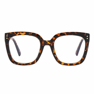
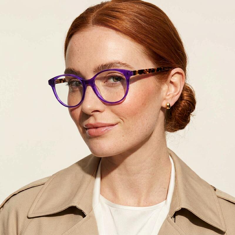
Most articles about color-frame eyewear break the color into five or six named shades and ask you to pick. With purple, that approach falls apart. There are easily a dozen names in marketing use — lavender, lilac, periwinkle, iris, mauve, orchid, plum, aubergine, eggplant, wine-purple, mulberry, royal — and the names overlap so much that two brands will sell the same dye lot under different labels.
A more useful split, and one that actually predicts how a frame will look on your face, is the cool/warm binary:
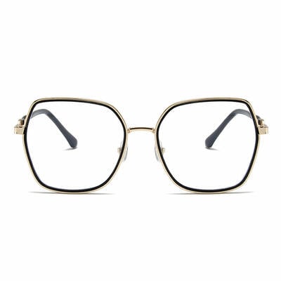
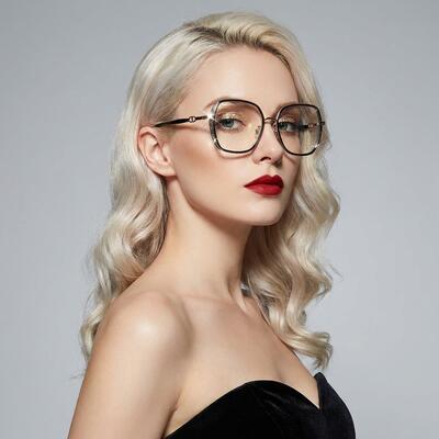
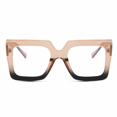
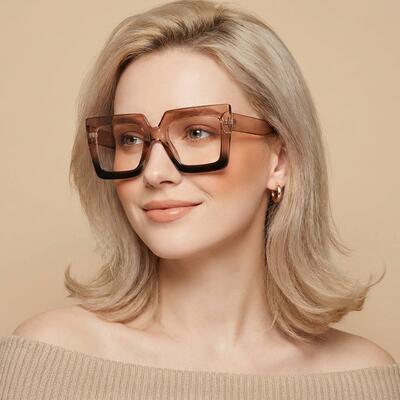
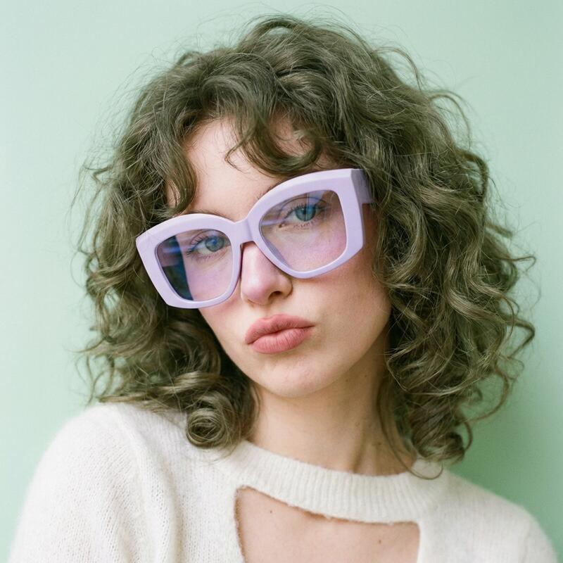
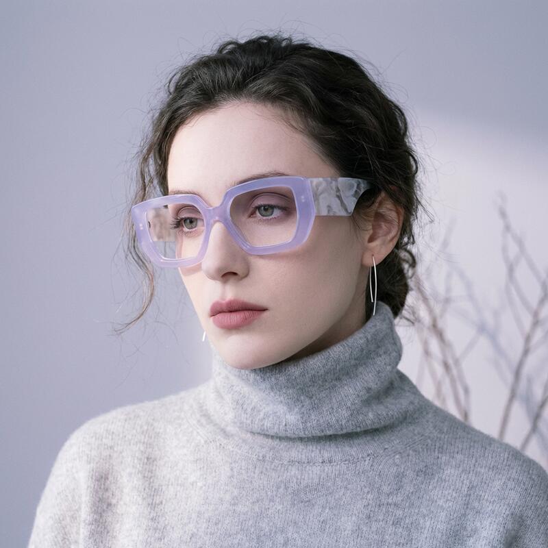
Cool purples (lavender, lilac, periwinkle, iris, soft mauve) lean toward blue. They photograph slightly icy, brighten under daylight, and tend to drift even cooler under office fluorescents. These are the shades currently surging on Pinterest under the "digital lavender" and "lavender haze" tags. The pastel-leaning ones — Aoolia's Joanne Purple Square and Halona Purple Cat Eye are good examples — read soft and modern.
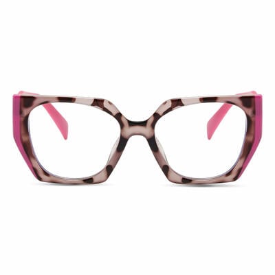
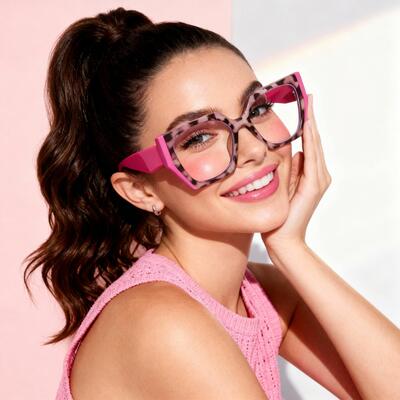
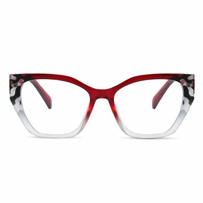
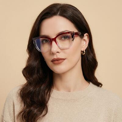
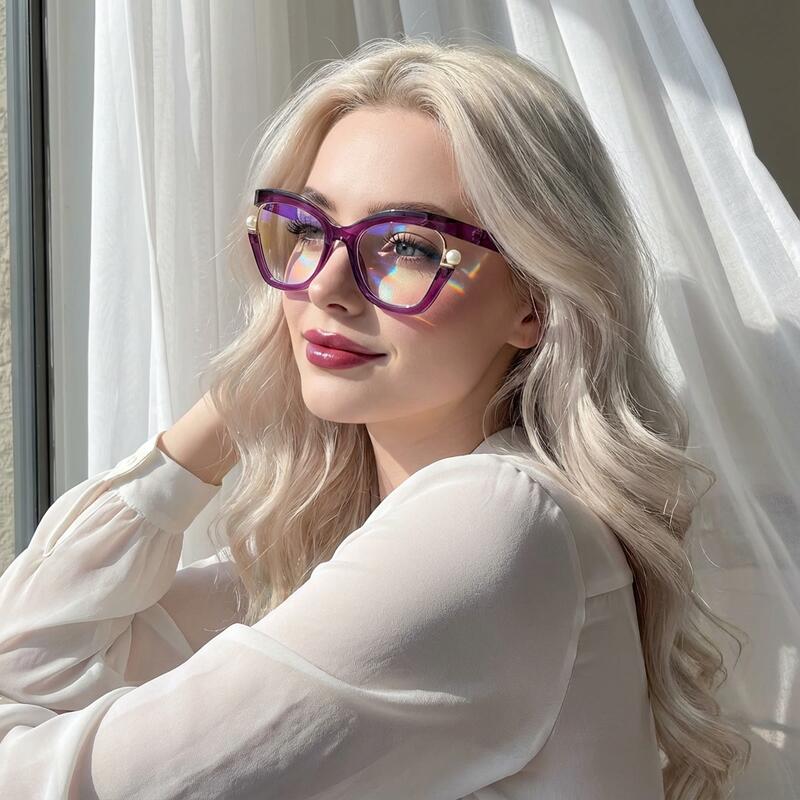
Warm purples (plum, aubergine, eggplant, mulberry, wine-purple, deep mauve) lean toward red. They photograph richer, hold up better under warm tungsten lighting, and read as more grounded — closer in mood to burgundy than to lavender. The Patrick Cat Eye and Steinbecie Rectangle fall here.
The split isn't arbitrary fashion language. It corresponds to where the dye's red:blue ratio actually sits in the acetate. A cool purple typically has 35–45% red pigment by weight; a warm purple has 55–65%. That fifteen-point swing is what creates the entirely different visual personality.
A quick test before you buy: if you held the frame next to lavender and the lavender looked muddy, it's a warm purple. If you held it next to plum and the plum looked dusty, it's a cool purple. Use the swatch references in product photos the same way.
For most US buyers, the warm family is the safer first purchase — it sits closer to neutrals already in your wardrobe and is less affected by the lighting-shift problem we'll get to next. The cool family is more striking but demands a bit more wardrobe coordination.

The Lighting Shift Problem (the One No One Else Talks About)
This is the section that exists nowhere else in the purple-eyewear literature, and it's the single most useful thing to know before you buy.
Because purple is a perceptual color rather than a single-wavelength color, the human eye is unusually sensitive to small shifts in the surrounding light. Three lighting environments matter:
Cool fluorescent (typical office, drugstore, public bathroom): A purple frame here will read up to 15% bluer than its true color. Warm purples drift toward neutral mauve; cool purples can drift toward periwinkle. This is generally the least flattering environment for any purple frame, and unfortunately it's the one where most people first see themselves wearing them — fitting-room mirrors are almost always lit this way.
Warm tungsten (most home lighting, restaurants): A purple frame here will read up to 10% redder than its true color. Cool purples drift toward soft mauve; warm purples drift toward burgundy or chocolate-purple. This is the most flattering environment for warm purples and the least representative for cool purples.
Daylight (5500K, natural sunlight): This is the color the frame was designed for. Manufacturers calibrate dye lots under 5500K standardized lighting, so daylight is the closest you'll get to "ground truth."
The practical buying advice this generates:
1.Try a virtual try-on by a window in mid-morning light. That's the closest at-home approximation of 5500K. Aoolia's try-on tool works in any lighting, but the colors you see will be most accurate near a window.
2.Don't make a purple-frame decision in a fitting room. Take photos in three different rooms before deciding.
3.If you wear glasses primarily indoors at work, lean warm. Plum, aubergine, and mulberry hold their character under fluorescent better than lavender does.
4.If you wear glasses primarily for going out and weekends, cool purples are more rewarding because they get to be themselves in daylight.
This is the kind of detail that only matters once, but it matters a lot.
How Purple Frames Read Against Each Eye Color
Color theory predicts that the most flattering frame color is the one that sits opposite your eye color on the wheel. Purple's complement is yellow-green — which means by classical theory, purple should flatter people with golden-yellow flecks in their eyes. In practice, the results are more interesting than the theory predicts.
Brown eyes: Purple frames have a particular gift for brown eyes. The yellow-green complement amplifies the gold and amber flecks most brown irises contain, making the eye color read warmer and more luminous than it does against a black frame. This is the single best-documented frame-color pairing in optical retail. Warm purples (plum, aubergine) work for any brown shade; cool purples (lavender, lilac) work best on light-medium brown.
Hazel eyes: Hazel is the eye color that benefits most dramatically from purple frames, more than any other frame color in the catalog. Hazel irises contain a mix of brown, green, and gold flecks, and purple amplifies all three simultaneously. Both cool and warm purples work — the cool family pulls out the green more, the warm family pulls out the brown and gold. Try both.
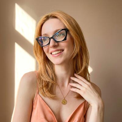
Blue eyes: Counterintuitive but true: cool purples (lavender and periwinkle especially) make blue eyes read softer and dreamier rather than sharper. Warm purples create more contrast and make the blue pop. There's no wrong answer; it's about the mood you want. Olivia Rodrigo's lavender phase is a useful reference point — she has blue eyes, and the lavender frames on her press tour read romantic rather than competing.
Green eyes: Green eyes get an unexpected lift from warm purples (plum, aubergine, mulberry) — the red undertone in those purples sits opposite green on the wheel and creates classical complementary contrast. Cool purples can compete with light green eyes; for darker forest-green eyes they're fine.
Gray eyes: Cool purples are the more flattering choice; gray and lavender share a cool undertone and harmonize cleanly. Warm purples on gray eyes can create a slight visual mismatch.
If you don't know your eye color category precisely (a lot of hazel eyes get called "brown" in passing), look in good daylight with a small mirror. You're checking for flecks, not the overall first impression.

What Wearing Purple Frames Signals in 2026
Frame color is communication whether you want it to be or not. Here's an honest read on what purple specifically broadcasts right now.
The biggest shift in the last three years has been a generational reclaiming. For a long stretch — roughly 2002 to 2020 — purple eyewear had a slightly dated, slightly Lisa-Frank-coded feeling in mainstream US fashion. That changed around 2022, when Pantone named Very Peri (a periwinkle-blue purple) Color of the Year, Taylor Swift released Lavender Haze, and Olivia Rodrigo's Sour and Guts eras anchored a soft-purple aesthetic for a generation of Gen Z women. The lavender renaissance that followed has now spread up the age spectrum: by 2025, lavender and lilac were appearing on women in their 50s and 60s at the same Manhattan brunch spots where they'd been considered too young a year earlier.
The mid-2020s trade publication The Frame Report now identifies purple — in both deep plum lens tints and lavender frame colors — as the standout color story of 2026 eyewear, calling it the "color that stands out without making too much of a statement." That last phrase is the precise read most US wearers want: presence without performance.
What this means practically:
A lavender or periwinkle frame in 2026 signals current, considered, design-aware. Not loud. The closest cultural reference point is the quiet personality category that used to be owned by clear frames.
A plum or aubergine frame signals editorial confidence — the move of someone who already knows how to dress and is using eyewear as a finishing flourish. This is the frame on a lot of magazine editors and gallery directors right now.
A bright violet or saturated royal-purple frame signals committed personal style. It's the strongest statement in the purple range and is mostly seen in creative-industry settings.
A purple frame on a man in 2026 reads notably different than it did five years ago. The Frame Report explicitly notes that men's purchase share in purple eyewear has grown significantly, and a plum or aubergine frame on a man no longer reads as a fashion-risk move — it reads as deliberate. Aoolia's Elvis Aviator, Toby Square, and Howar Rectangle are sold roughly evenly between men and women.
A frame in cherry red or sun-yellow says you want to be seen. A purple frame says you want to be remembered.
The Photography Question: Why Purple Frames Are Harder to Shop For Online
If you've ever looked at five different retailers' photos of "purple frames" and felt like none of them quite agreed on the color — there's a reason.
Purple is the single hardest color for digital cameras to capture accurately. Most consumer cameras and phone sensors use a sensitivity curve modeled on human vision, but because purple isn't a single wavelength, the camera has to guess. The sensor sees red signal and blue signal arriving simultaneously and outputs an interpretation that depends on the manufacturer's color science (Apple, Google, Samsung, and Canon all render purple slightly differently). Then the screen you view the photo on does its own interpretation, again differently per manufacturer.
The net effect is that two product photos of the same physical frame, shot in the same studio, can land on a customer's screen looking visibly different.
What to do about it:
1.Trust the product page's swatch references over the modeled photos. Studio lighting is usually 5500K-calibrated, which is the most honest rendering.
2.Use the virtual try-on tool against a neutral wall in natural light. The try-on system uses your face's reflected light to white-balance the frame color more accurately than a static photo can.
3.If you're between two shades, order the warmer one. Warm purples photograph more reliably and read closer to their true color across more screens.
4.Read the customer try-on photos at the bottom of product pages. Customer phone cameras under living-room light are actually a more honest preview of how the frame will look in your daily life than a studio shot.

This is the same reason purple cars, purple lipstick, and purple paint chips are notoriously hard to buy online. It's not the retailer's fault. It's a property of the color.
Material, Lens, and Build Notes
A frame color is only as good as the frame underneath it. A few things worth knowing about how purple is actually built into eyewear:
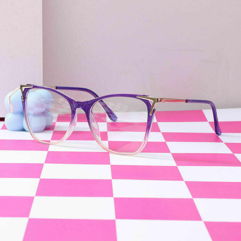
Acetate (the dominant material in Aoolia's purple range — 34 of 98 frames): Acetate is the gold standard for color depth because the dye is mixed into the cellulose sheet before the frame is cut. The color goes all the way through. If a corner gets scratched, the color underneath is the same. Acetate also handles purple particularly well because the long polymer chains hold both red and blue pigments stably — important for a color built from two pigments rather than one.
TR90 (11 frames): A high-tech thermoplastic that's lighter and more flexible than acetate. The color is also dyed through, but TR90 doesn't render very dark purples as richly as acetate does. It's a better choice for lavender and lilac than for aubergine or wine-purple.
Titanium (24 frames): Used mostly for the metal-front or wire-front purple frames. The purple here is applied as an IP (ion plating) coating — bonded to the metal at the molecular level, far more durable than cheap electroplating. A properly IP-plated titanium purple frame holds its color for years. A poorly electroplated one wears through at contact points within twelve months. This is the single biggest quality difference in metal purple frames, and it's worth checking.
Plastic (9 frames): Entry-level. Color is dyed in but the material itself is less stable under UV than acetate. Fine for second-pair backup, less ideal as a daily driver.
On lenses: Purple acetate frames pair beautifully with blue-light filtering lenses because the faint amber tint of the filter is invisible against the purple — better camouflage than against clear or black frames. They also work cleanly with progressive lenses; the visual landmarks of a progressive corridor disappear into the color depth.
Prescription threshold: If your prescription is stronger than about -3.00, request high-index lenses (1.67 or 1.74). Lighter-toned cool purples (lavender, lilac) show lens edge thickness more visibly than darker plums do, so high-index matters more in this category than in black or tortoise. Every Aoolia order is reviewed by an in-house optician before lenses are cut.
Will Purple Frames Fade in the Sun?
The honest answer is: more than black, less than red or yellow.
Purple is a two-pigment color, and the red component (whether it's a quinacridone, anthraquinone, or modern azo-based pigment) is the more UV-sensitive of the two. Under prolonged sun exposure, what fades is the red. The frame doesn't lose color uniformly — it shifts. A warm plum frame can drift toward dusty blue-purple over two or three years of heavy outdoor wear. A cool lavender frame can drift toward icy gray.
That's worst case. Real-world outcomes for most US wearers:
Acetate purple frames worn primarily indoors: Effectively no visible color shift in five years.
Acetate purple frames worn outdoors several hours daily: Slight shift in 2–3 years, more noticeable in warmer purples than cool.
TR90 purple frames are more UV-stable than acetate.
IP-plated titanium purple frames are the most UV-stable of all and effectively don't fade.
How to Style Purple Frames Without Looking Costumey
The instinct most people have when they first wear purple frames is to coordinate them with something else purple in their outfit. This is the exact wrong move. Two purple items in one outfit reads as a costume; one reads as a deliberate accent.
A few guidelines that hold up across the wardrobe:
Cool purples (lavender, lilac, periwinkle) pair best with: cream, soft white, navy, denim, warm browns, sage green, soft gray. Avoid pairing with hot pink, bright purple, or muddy mustard — these compete.
Warm purples (plum, aubergine, mulberry) pair best with: black, charcoal, camel, ivory, forest green, burgundy, deep teal, gold-toned metals. They're more wardrobe-flexible than cool purples and read sharper against neutrals.
Metallic accessories: Gold and rose-gold flatter warm purples; silver and gunmetal flatter cool purples. Mixing metals around a purple frame is one of the few times the "mixed metals" rule genuinely starts to look unintentional.
Lipstick on women (the question that comes up most): wear what you already love. Purple frames don't dictate lipstick the way red frames do. The exception: don't wear a purple-leaning lipstick with purple frames. It reads as accidental.
Hair color doesn't change the calculus much. Purple frames flatter every hair color from platinum to jet black. If you have purple-tinted hair, switch to a different frame color — that's the only true clash.
Frequently Asked Questions
Are purple glasses still in style in 2026? Yes, and arguably more in than at any point in the last twenty years. Trade publication The Frame Report named purple — in both lavender and deep-plum variants — as one of the top color stories of 2026 eyewear, and "digital lavender" appears on most major eyewear-industry trend forecasts for the year. Pantone's 2022 Color of the Year (Very Peri) and the subsequent lavender-haze cultural moment have moved purple from "bold risk" to "current and considered."
Do purple frames suit brown eyes? Exceptionally well. Purple sits opposite yellow-green on the color wheel, which means purple frames amplify the gold and amber flecks in most brown irises. This makes the eye color appear warmer and more luminous than it reads against black or tortoise frames. Warm purples (plum, aubergine) flatter any brown; cool purples (lavender, lilac) flatter light-to-medium brown best.
What's the difference between lavender and lilac? Lavender has slightly more blue in it; lilac has slightly more pink. In practice, lavender reads cooler and more grown-up, lilac reads softer and more nostalgic. Both belong to the cool purple family, and both shift toward grayer under fluorescent lighting.
Can men wear purple glasses? Comfortably yes, especially in warm purples — plum, aubergine, and mulberry read as considered rather than risky. Industry data from 2026 shows male purchase share in purple eyewear has grown notably year over year. Aoolia's Elvis Aviator, Toby Square, and Howar Rectangle are sold roughly evenly across genders.
Are purple frames unprofessional for work? Almost never, with one specific exception. Lavender and warm-purple frames are workplace-appropriate in virtually any US white-collar setting in 2026 — financial services, legal, healthcare, corporate, education, creative industries. The exception is a saturated bright-violet or royal-purple frame in conservative finance or court settings, where any saturated frame color would be a stretch. If you're not sure, lean toward deep plum or aubergine; they read closer to burgundy than to "color frame."
Will my purple frames fade? Lightly, over years, depending on material and sun exposure. Acetate worn outdoors for several hours daily shifts slightly in 2–3 years; acetate worn primarily indoors doesn't visibly shift in 5+ years. IP-plated titanium and TR90 are more UV-stable than acetate. Storing frames in a case when not worn and rinsing off sunscreen residue significantly extends color life.
Lavender vs plum — which should I pick if I can only get one? If you wear glasses primarily indoors at work, pick plum (warm purples hold their character under fluorescent lighting). If you wear glasses primarily outdoors and on weekends, pick lavender (cool purples bloom under daylight). If you have a wardrobe that runs to black, charcoal, and camel, pick plum. If your wardrobe runs to cream, denim, and soft neutrals, pick lavender.
Do purple glasses photograph well? They photograph honestly — but inconsistently across devices. Different phone cameras render purple differently because there's no single wavelength to anchor the rendering. The most reliable previews are customer try-on photos under household lighting, not studio product shots.
What about purple-tinted lenses (the amber-purple ones)? That's a different product. This guide is about purple-colored frames (the plastic or metal is purple). Purple-tinted lenses are a sunglasses category — they're amber-purple tinted lenses worn for visual style or contrast enhancement. Aoolia's prescription purple-tinted lens options live in the sunglasses category.
Where should I start if I've never worn a colored frame before? A medium-saturation warm purple — something in the plum or aubergine range, in a square or cat-eye shape, around the $20–$30 price point. That's the safest first purple frame for almost any face shape, skin tone, and wardrobe. Aoolia's Patrick Cat Eye and Steinbecie Rectangle are good starting points.
Shop the Collection
The full Aoolia purple glasses — 98 frames in lavender, lilac, plum, aubergine, mulberry, and wine-purple, in acetate, titanium, and TR90, starting at $6.95 with prescription lenses available on every style — is the best place to start if you want to test the color theory in this guide against your own face.
If you're not sure about your face shape first, use the virtual try-on tool on any product page. Try one warm purple and one cool purple, in two different lighting environments at home, and you'll feel the difference within five minutes — the lighting-shift effect described above isn't subtle once you know to look for it.
Every Aoolia prescription order is reviewed by an in-house optician before the lenses are cut, with single-vision, progressive, bifocal, and blue-light-filtering options available on every purple frame in the catalog.